I hope this could one day get a second pass and be made available for the Japanese version for us Japanese players!
Also, upon starting, I noticed that the highlights on Bowser's sprite are darker than the rest of his skin in the first fight (and presumably other fights and appearances). Maybe this hack could get a second pass for quality control? I'd be willing to point out any other issues I find if that would be a possibility!
Coming back to this, I took a screenshot to show what I mean.
I think this was probably a mistake that was overlooked, as the highlights of his skin almost appear darker than the rest of his skin, and therefore the highlights are hard to see.
I made a comparison, on the left is the original game, the middle is the romhack, and the right is an edit that uses the highlight color from the original game.

Lastly, I'm not a fan of a couple of things.
Like how Luigi's green is changed to be more of a blueish green, which in my opinion strays a bit too far from the original game's art direction. I think the current version is based on his appearance in Bowser's Inside Story, which does make the shadows more blueish, but that's not how the original game was. Even if you look at Partners in Time Luigi, which WAS made with a backlit screen in mind, his green was much more vibrant and less blue.
Not exactly the best comparison, but here's a screenshot of the patch, with a sprite of Luigi from original Superstar in the middle, and Partners in Time pasted next to it.

You can see that the vibrancy of his green was toned down a LITTLE bit and made a BIT more blue in Partners, but not very much at all. I feel like the iconic look of his green from the original is lost with this romhack.
Mario's Red is only very slightly changed to be more vibrant, so I don't know why Luigi's was altered so drastically.
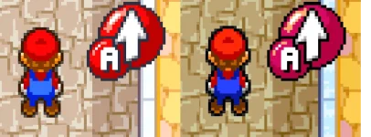
The other thing I've noticed so far is how the Action Command buttons are different colors from the main heroes, particularly with Mario's being a shade of magenta vs his bright red.
Here's a screenshot, original on left and hack on right, with Mario from each respective version edited to be right next to the icon.

You can see in the original that the icon is the same exact shade of red that Mario is, but in the hack it's a very different purplish. Again, I just feel like the iconography of the main boy's colors really strays far from what the original game's art direction was. Whenever I played this game as a kid, Mario and Luigi really felt like embodiments of those colors. Mario IS red to me, and Luigi IS green. Changing their colors in this way only lessens that feeling in my opinion.
Again, it would be really nice if this hack could get another pass, I would be willing to help if any documentation on the tools used could be given! Thank you again for making this hack, and sorry for being so critical! I just want this hack to be the very best it can be because I love this game so much!!
I really appreciate the effort that's gone into this!